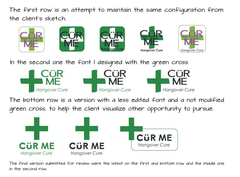
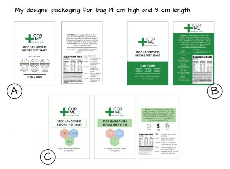
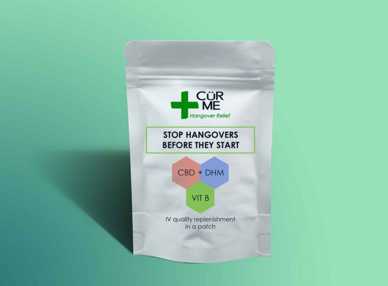
Cür me – Logo and Packaging
Cür Me

Cür me – Logo and Packaging

MISSION

This brand created a patch to meet the need for hangovers remedies in a formulation that combine CBD with additional functional ingredients. It will be supplied both in dispensaries and pharmacies. Logo design and packaging design are needed.

CASE STUDY

The product has to show a logo and packaging suitable for a wide distribution, able to focus on purpose, quality of ingredients while maintaining attractiveness. Since the name of the brand has umlaut on the letter they asked me to combine the two resembling a smiley face.

The challenge for this design is to realize packaging and logo able to interest a vary target audience, between 21 and 65+ with no significant difference between genders, education and income, although a significant amount of consumer could be found in female, mostly because of a slower reaction in the metabolism while consuming alcohol, hence it would make them a primary consumer of this product (sources: 2021 US CBD Consumer Report and American Addiction Center). There is no social media in place for this brand, my researches in finding and understanding the right audience for this product is based after a meeting with the owner and some medical studies on this argument.

Cür Me logo's briefing
MY WORK

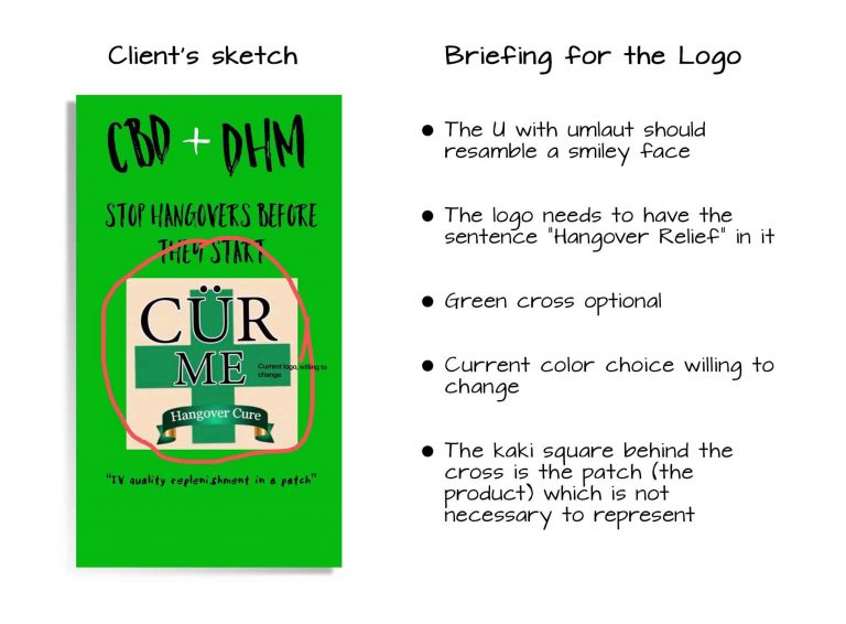
Starting from the client’s sketch, I focused on the logo design first, using the Ü in order to obtain a face, which I wanted to be not too cartoonish, risking otherwise to seems unreliable as a product. My initial thought was to use a free font with a letter already similar to a smile but eventually I modified one, allowing major focus on the emoticon which blend between the other letters.

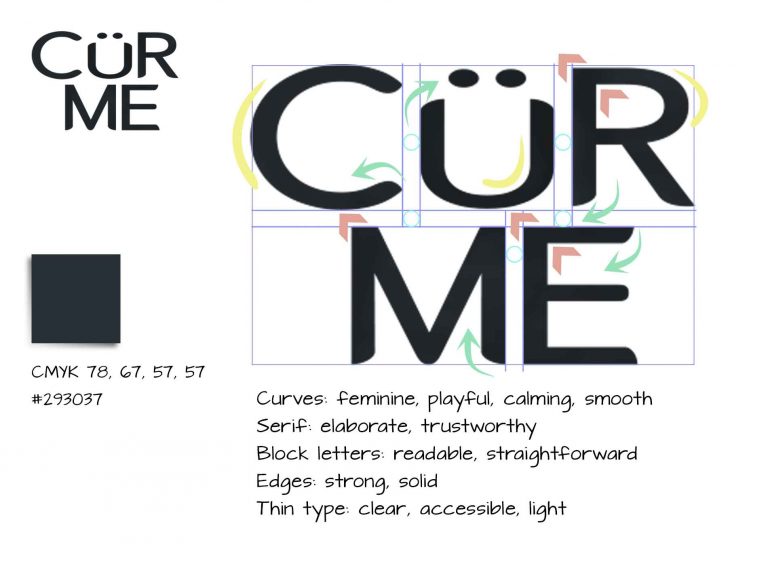
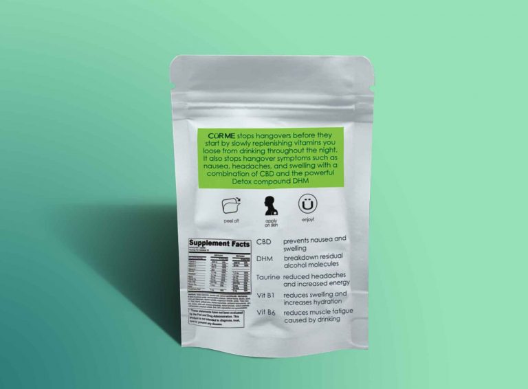
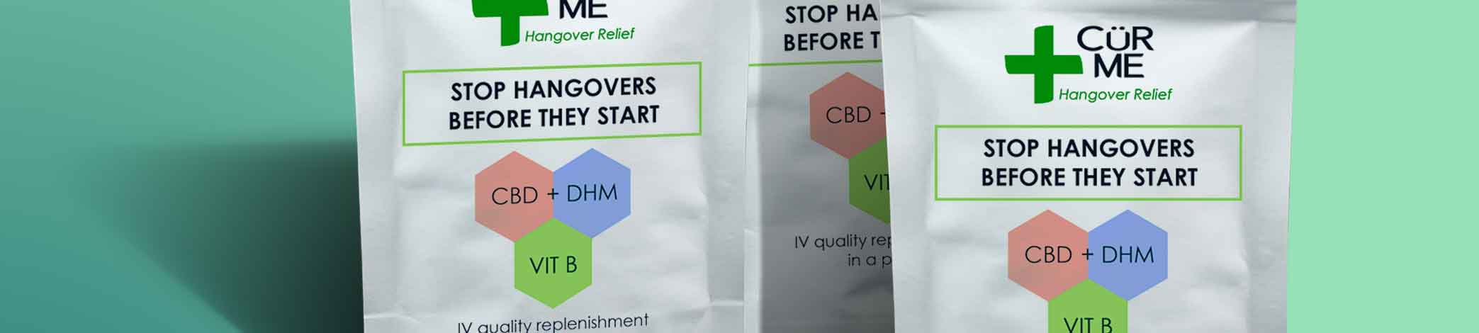
In order to obtain this result, I chose a sans serif font to edit, first I worked with colours and opposites to highlight words and element around the text but, eventually arranging the words one on top of the other. The result had a strong visual impact on the client, that loved immediately and is also easy to read on a shelf and from a distance. 

The result is a clean and tidy type, readable, within equal space between the letters, it includes serif on the ends alongside edges, and curves to give it character. The font is light, reliable and clear while the smiley face is well combined. 

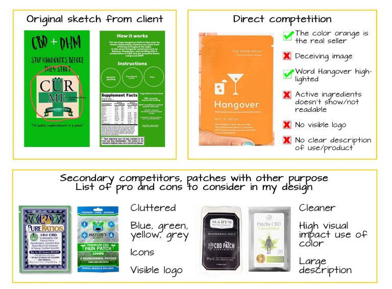
To design this logo my researches were based on finding similar products on the market and understand the placement of the packaging near other items.

Cür Me logo's font

Once created the font, I added the caption in Century Gothic to enable future changes.

I did several attempt of enclosing the elements, based on the client’s sketch, eventually deciding to add a green cross, shaped on the edges like I did for the font, going for an image compatible with medical products.

I then proceeded playing with colours and overlaps, and selected three options for feedback and request of alteration.

Cür Me logos tryout for review

Once obtained the approval on the logo, I started working on the packaging, which will be approximately 10×9 cm bag.

The client send me the sketch of the idea he wanted for the final result, underlining the importance to focus on the active ingredients. I developed three different approaches based on the consumer demographic and the ideas of my client.

Because we do not have dispensaries in my Country, I looked at examples of similar items (with CBD) online, finding the direct competition with similar communication and designs between each others. The major objective of the Client is to place a product that can be distinguishable, easy to find in the crowd but mostly, able to interest a large demographic with various backgrounds.

I opted for easy to read icons, a clean and lean packaging that communicate pharmaceutical and organic herbal ingredients and used less customary colours, to avoid restriction from more conservative perspective clients. 

Cür Me packaging competitors side by side
Cür Me packaging designs suggested
Impact

The client really liked the three designs and decided to go for the C option, acknowledging the right choice for the colours and disposition of the elements, he’s also positive it will stand out among the other similar products.

Cür Me packaging front
Cür Me packaging back

Fran

Francesca Funari is a free lance graphic and content designer. Available for brand identity, print design, content design using Photoshop, Illustrator and Indesign, with lots of passions and interests, willing to learn and increasing her knowledge.
Close Menu