Colli Veneti POP! – Logo Design

Colli Veneti POP! – Logo Design

MISSION

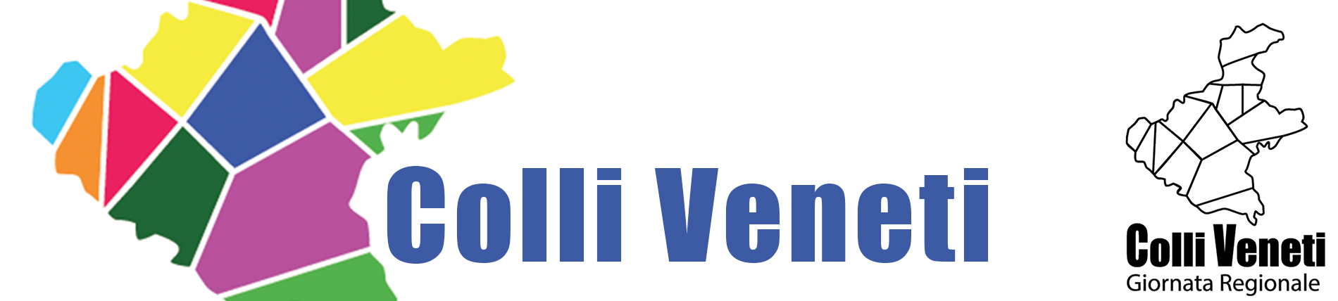
The request by the Veneto, Italian Region is to create a logo capable of representing multiple territories and to be used in public events and marketing advertising.

CASE STUDY

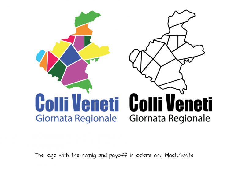
The logo needs to be able to create a unique and unanimous representation of twelve involved areas of the region, their culture, their landscape, food and wine tradition, carrying both a sense of community and belonging.

It needs to be used as the official brand identity of Colli Veneti (Hills of Veneto) in official communications, campaigns, promotional material, on websites design and social media…

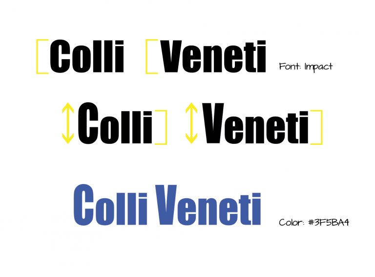
The graphic design logo, with no specific reference to an area, needs to be eventually shown with the naming: “Colli Veneti” and occasionally “Giornata Regionale”.

Colli Veneti - researching for branding
my work

In order to maintain continuity between brands of the same institution, I though to use a similar style. Upon researching what are the peculiarity of the area this logo needs to represent, I noticed they were already lending a colour to every important aspect of the interested land. I traced the shape of the Region as unique and unanimous icon of the territory and highlight the areas of interest with the colours. Initially I wanted to apply the same palette already in use but since many of them share similar focus (parks, mountains, art cities…) I choose a different approach for the distribution of colours, creating new and more vibrant nuances.

I opted for a sans serif font , bold to accompany the strong cut of the graphic line, also easy to read in both big and little prints, I chose “Inpact” and edited the capital letters.

Colli Veneti - new color scale
Colli Veneti - font editing
inpact

My design want to maintain a graphic for a brand that already have a strong communication in place, to avoid too much noise in the brand identity of Veneto. This result can help avoid misunderstanding between department of the same institution, even though would be interesting valuate with the audience a more creative alternative; I wasn’t given the opportunity to made a real study on the final user and my choices were mostly based on researches made valuating the target through social media communication and engagement.

I chose brighter colours in my design, and rough, not detailed cuts of the interested areas, using sharp edges to make it engaging for a younger audience. Overall this logo design is vivid enough to be consider modern, immediate and well blended with the brand identity of this institution.

Colli Veneti by Francesca Funari

Fran

Francesca Funari is a free lance graphic and content designer. Available for brand identity, print design, content design using Photoshop, Illustrator and Indesign, with lots of passions and interests, willing to learn and increasing her knowledge.

Leave a Reply

Close Menu