Pa i Picar – Brand Identity
Pa i Picar: logotype

Pa i Picar – Brand Identity

Mission

The Pa i Picar shop is located in Barcelona, in a neighborhood frequented by university students, sells typical Italian artisan bakery products, such as piadina, pizza and ice cream.

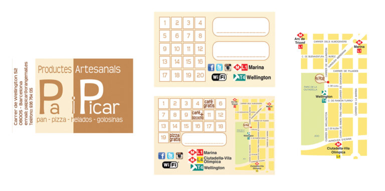
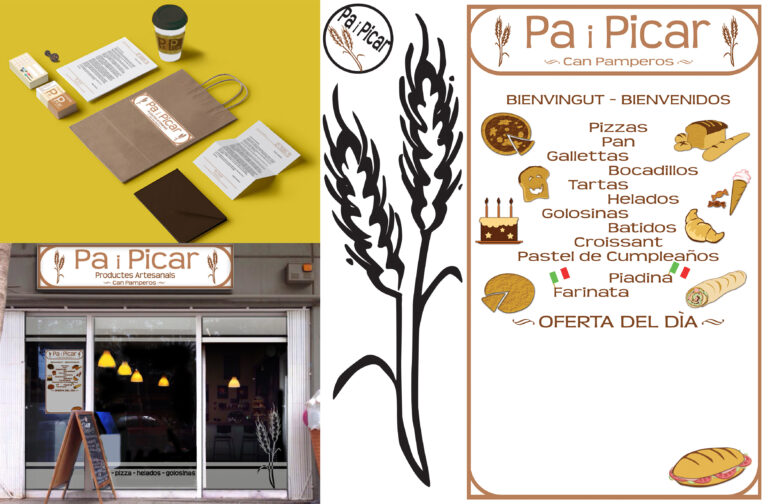
They requested the definition of their Brand Identity, the Business Card, a customized Stamp, the ability to use a logo for Labels, Sign, Letterhead, a Window Sticker and a Blackboard with drawings.

My Work
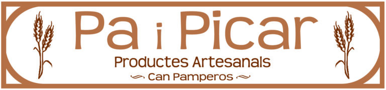
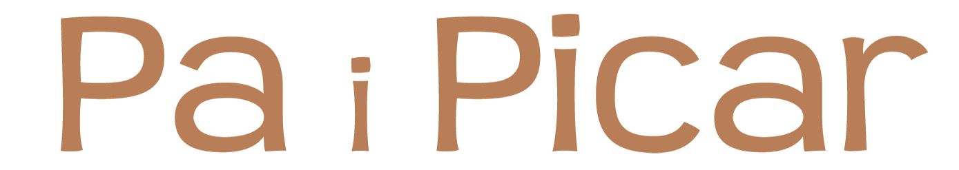
The client had already designed a draft of the “Pa i Picar” logotype and wanted to integrate it into a sign capable of representing healthy and artisanal food but in a fun way, for a young target. It was decided to create a graph shaped like a spike of wheat to introduce the concept linked to the products they sell, bakery and artisanal, and a simple and playful font was chosen. The result of the banner was highly appreciated and the client asked to have a high resolution file to being able of using it for printing labels in various size and one to fit a profile image on social media and one to fit the size of the cover image on Facebook.
banner design
Pa i Picar: banner
Business/loyalty Card

The customer is offered a loyalty card which is integrated into the business card, together with a map created with the aim of indicating which transports lead to the store. On the front is created a contrast with the colors that play with the font, this is different from the use in the banner or the logo, to help attract a majority of younger target. On the back they asked for two version of the loyalty program, the one with the map is currently in use.

business card map
Business Card: variations
The board

The biggest chunk of this project was creating images for products the client wanted to include on the blackboard. They wanted to be able to write down the offer for the day but also have always their main seller displayed. Is asked a realistic style, with colors and effects that resemble bread products but in a stylized way. After made some sketches with Illustrator the preferred ones were chosen and than colored to obtain the effect desired, and they love it.

bread drawings
Drawings
Inpact

Overall this project was interesting because it asked me to combine two different aspect from one to another: fun but realistic portrayal of healthy products. In a later moment the client asked for a window sticker, because the board has been placed in the window, I decided to use the spike as reference the overall project, also for the stamp they made to collect points on the cards. The target was reached as the shop’s regulars are mainly young: tables and shelves have been added for on-site consumption and the number of new products have been added to the menu but the number one seller remains the ones on the board.

Pa i Picar: presentation

Fran

Francesca Funari is a free lance graphic and content designer. Available for brand identity, print design, content design using Photoshop, Illustrator and Indesign, with lots of passions and interests, willing to learn and increasing her knowledge.

Leave a Reply

Close Menu