Susie ice cream – stickers for advertising and window shops

Susie ice cream – stickers for advertising and window shops

MISSION

Susie is a Netherland based company, which create vegan ice creams made from 100% salvaged fruit that will not meet the quality requirements for distributors, they also don’t use additives or added sugars. Susie’s products promote an healthier and more sustainable life. The objective is to create two stickers starting from an existing flyer.

CASE STUDY

After edit size and text as requested, the aim is to try create something visual appealing and unique. The Company want to transform the initial design in order to attract attention on specific subject, like the food waste issue.

Front and Back original Susie Flier
MY WORK

The client needs two window stickers, edited from each page of the original flier. From the “front”: change the title, some text and colours, and an edit for the logo image, with Photoshop. From the “back”: colours need changes, the list of info needs a better arrangement.

From my point of view the front of the flier need to become more interesting, by enlarging the logo and putting only the crucial information, while in the back is important to clean, reorder, amplify the information of the list and possible avoid all the lines.

flyers
Susie, Stickers with logo

I made a big title of the message “Here available healty and sustainable Ice cream!”, using black and bold font, same with the website’s name in the footer. With the logo design, the new arrangements of the words and the editing of the picture, make it less cluttered and cleaner than before. I also decided to add the word NEW in the upper left corner to give balance with the pink enlarged icon on the opposite side.

I went a little beyond the Client’s request releasing her three version of the stickers, two poster to place horizontal or vertical, and one round with just the logo.

locandine
Susie, sticker with boxes, proposal 1-3

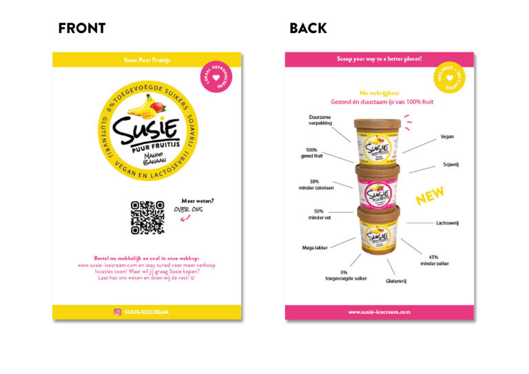
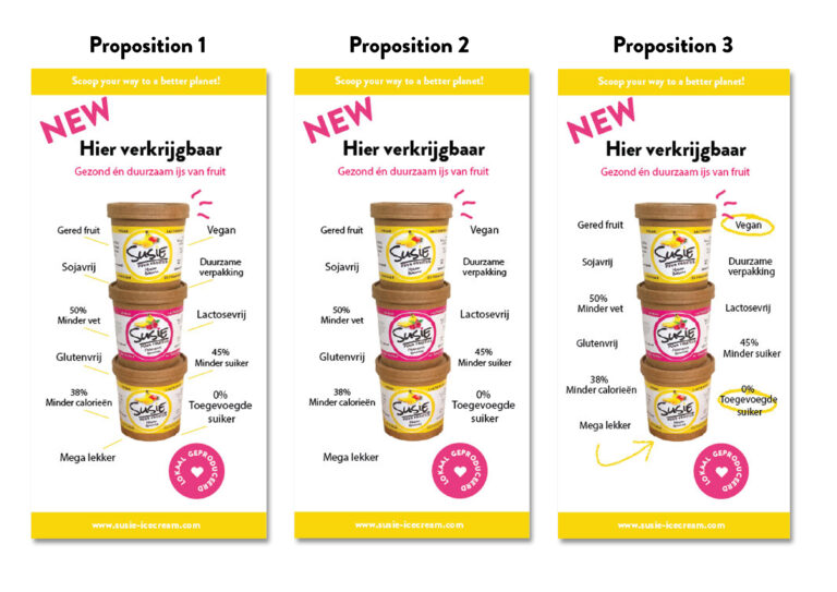
While working on the other restyling, the one based on the back of the original flier, I did exactly what the client was asking for, placing all the descriptions in balance, centred as asked but in order to obtain a better result, editing the word NEW, the title and the pink wobbly lines on top of the first box of the pile. In the Proposition n.1 the colour of the lines has changed in the attempt of creating less disturbance but I give the clients both the Proposition 1 and 2 to help visualize the option with no lines.

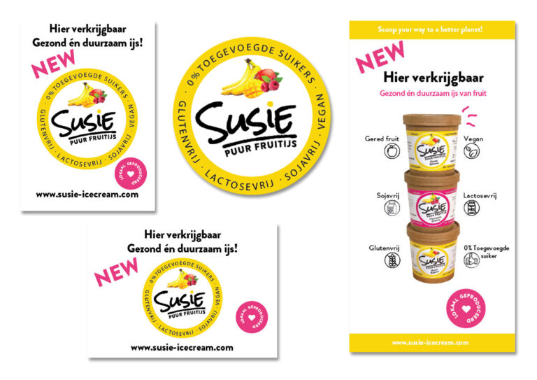
Additionally I designed Proposition n.3 because in our conversations came out that some description are more important than others, in my vision changing the size or the heaviness of the text for just some info, would have make the effort invisible, instead I used some graphic elements, similar to the logo and the pink wobbly lines, to underline some of the text, maintaining the same breezy style of communication.

volantini
Susie, sticker with boxes, proposal 4-7

Engaged by the graph elements the client propose to use icons and ask me to try different approaches for the arrangement. I used “Vegan Icons” by Woodcutter that in my opinion have a similar communication style as the brand, and using my background in sketching and drawing, edited some of them in order to represent the description accordingly.

In this phase, various design edits were need to help the Client find its preferred visual for the final poster, and eventually help her see how the elements can interact in the page, one with the other. 

vetrofania
Susie, sticker with boxes, proposal 8 and 9

In our last meeting with the Client, we opted for a cleaned version (n.8), deciding to focus only on the important descriptions and avoiding the crowded effect. I finally edit the white space left, enlarging text and graphic elements with proposition n. 9, the one which has been approved.

IMPACT

The stickers will be delivered to the shops that sells Susie Ice Cream in order for them to place it on the boards inside the store, on the windows and thankfully to my effort, the round one will also on cars and maybe given as freebies to customers.

My skills and reliability helped create a strong relationship with this Client that subsequently proposed me other jobs of image editing and content design for the company’s website and ecommerce.

sticker poster
Susie final stikers

Fran

Francesca Funari is a free lance graphic and content designer. Available for brand identity, print design, content design using Photoshop, Illustrator and Indesign, with lots of passions and interests, willing to learn and increasing her knowledge.

Leave a Reply

Close Menu